


Thai Yoga Massage by Barry Dale
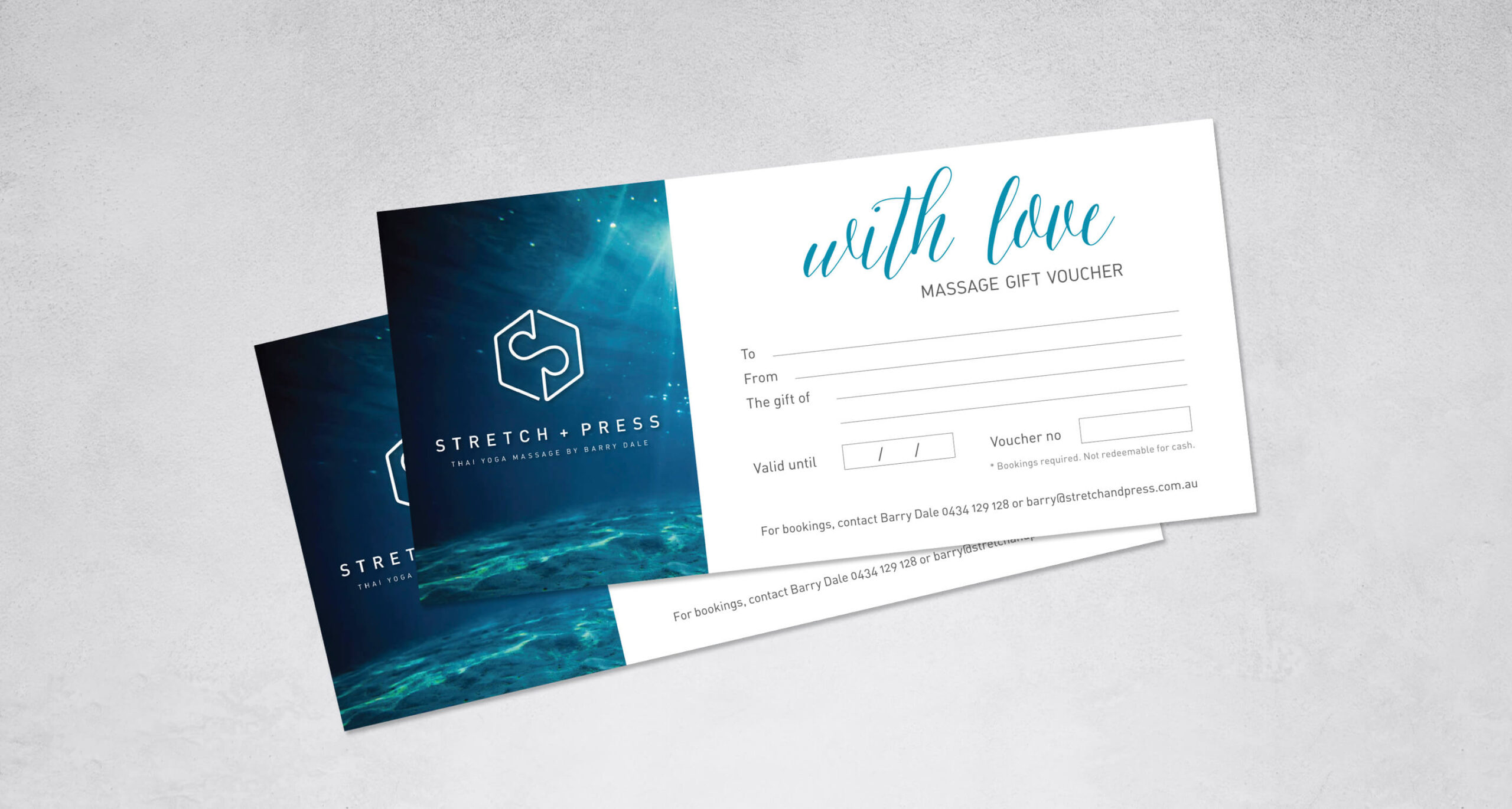
Stretch + Press logo is inspired by the aimed outcome of Thai Yoga Massage – the free, continuous and steady flow of energy in the body. In the logo it is represented by using an abbreviation of the business name S & P and combining it into a continuous line. The outcome also suggests an infinity symbol, which stands for permanence and completeness. The outer shape of the symbol, the hexagon, relates to symmetry, balance and harmony.
The use of underwater imagery in styling was inspired by the calmness people feel after the Thai Yoga Massage – relating to the complete serenity underneath the surface.
The result has given Barry the confidence in starting his new business with a professional and respectable brand that will stay with him for many years to come and is adaptable to the growth of his business.
+ Branding & logo design
+ Stationery
+ Gift vouchers
+ Photography
BARRY DALE
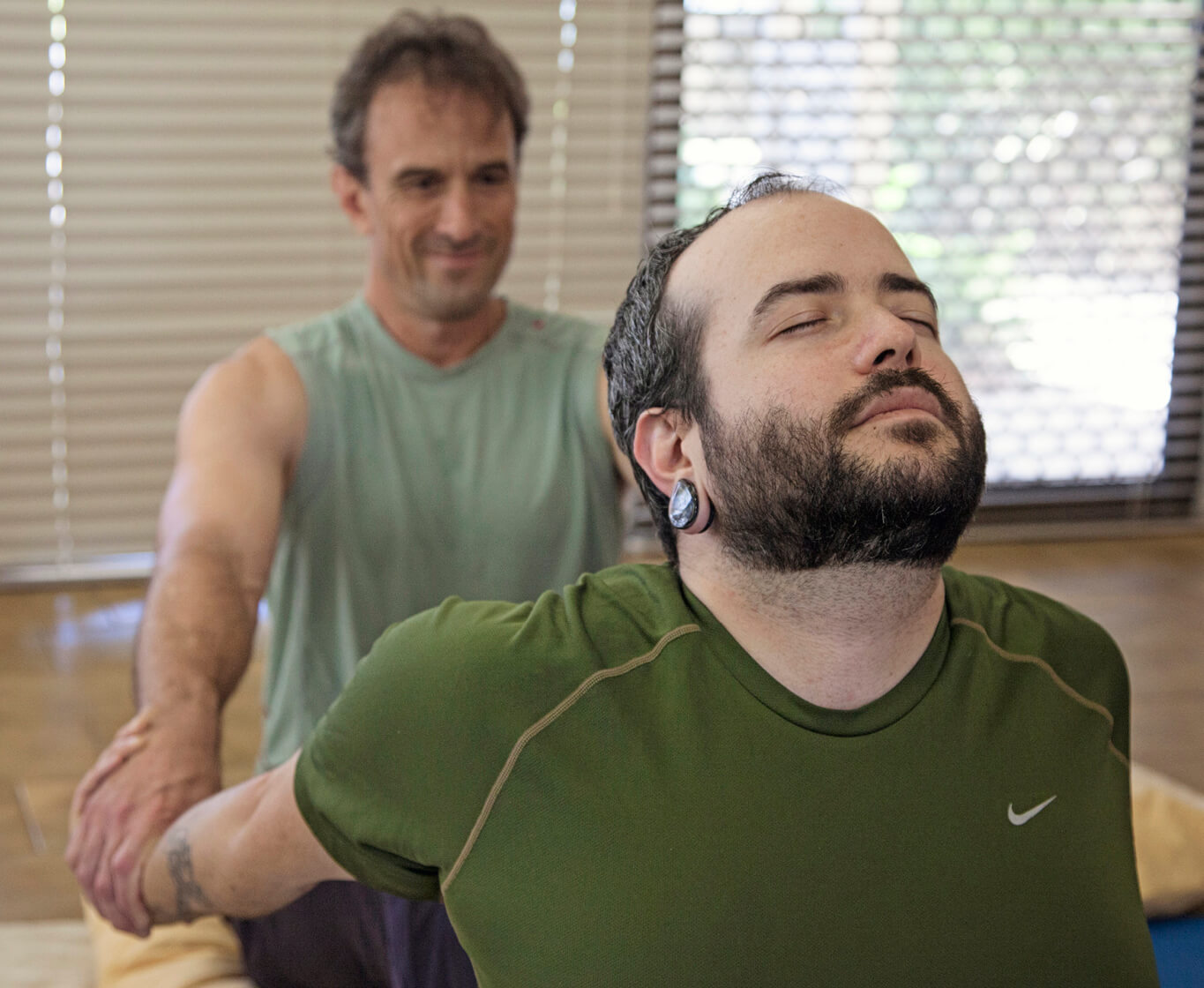
Katre did a photoshoot for me when I was setting up my massage business. She took great care to find out about me and the nature of my business, and then set up the shots for the best light and background. My model customer and I felt totally at ease with her. Her turnaround was fast. She also designed my logo, brochures and gift certificates, which look highly professional and suit my personality and business perfectly. I am still happy with her work years down the track.
